During a public health crisis, quick and accurate use of outbreak analytics tools is critical in the fight against the clock to mitigate the spread of infectious diseases. Through visualization, modeling, and forecasting, these tools help epidemiologists, physicians, and policymakers better understand outbreak data in real-time.
The problem? The tools to collect, clean, and analyze the data can vary dramatically from nation to nation and aren’t always interoperable, making it incredibly difficult to contextualize and understand local, regional, and global data as a whole.
That’s where Epiverse comes in.

Launched by data.org in 2021, Epiverse is a global collaborative working to develop a trustworthy data analysis ecosystem dedicated to getting ahead of the next public health crisis. Specifically, Epiverse is empowering academia, governments, multilateral organizations, and others with open-source, privacy-preserving tools to derive new insights from data.
But even in an ecosystem as strong and robust as Epiverse, a good map is key. Outbreak analysts need to combine many tools to clean, describe, and analyze data to inform operations—all under considerable time pressure.
There are many outbreak analytics tools out there and some connect with each other seamlessly, but many do not. It’s a lot to remember when choosing which suite of tools best suits your goals.
Avinash Laddha Senior Data Analyst data.org
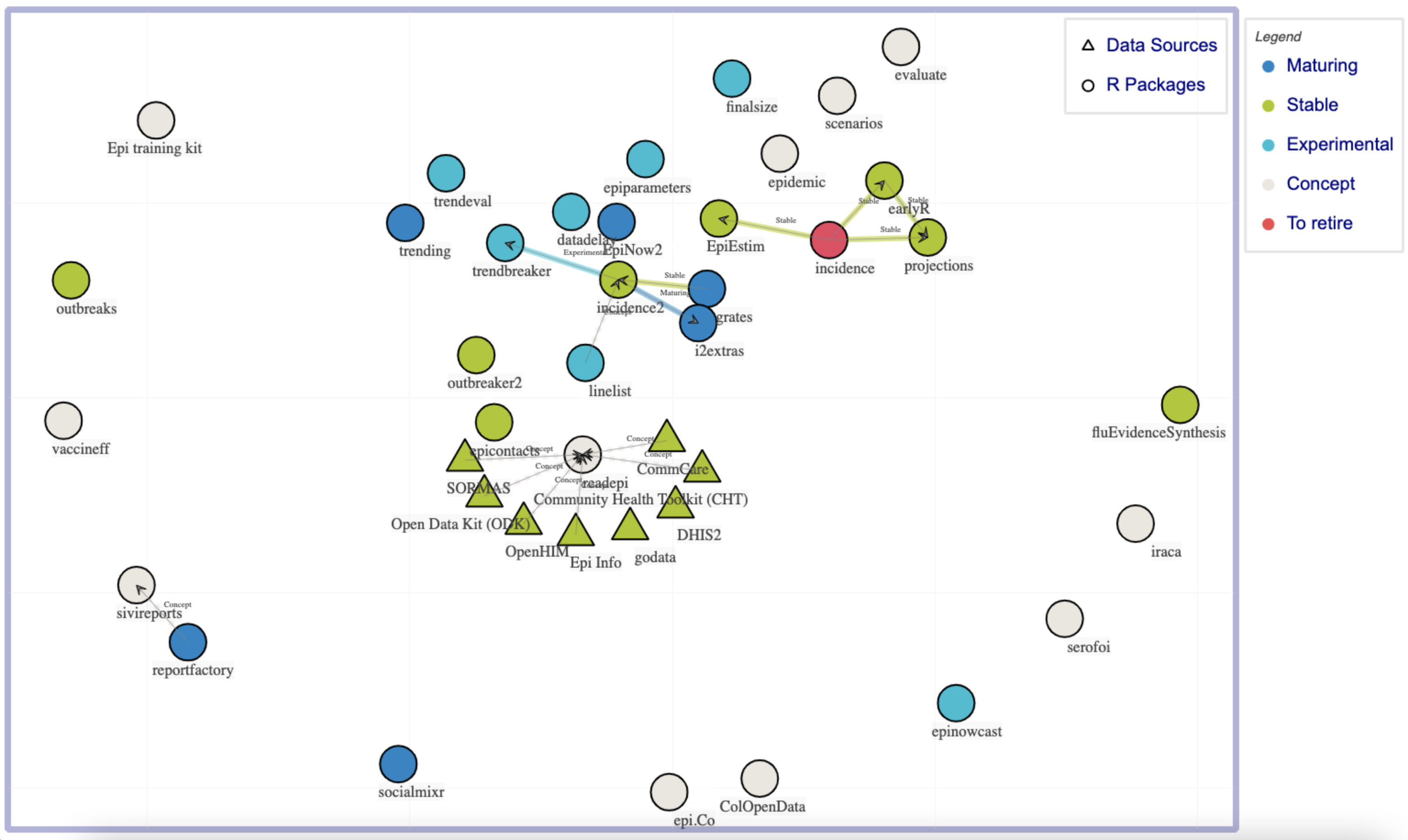
“When trying to go from raw information to actionable intel, analysts face huge gaps to jump over and bridges to build,” says Senior Analyst Avinash Laddha. Together with Epiverse Software Design and Implementation Lead Thibaut Jombart, Laddha has created the Epiverse CONNECT Map, a regularly-updated visualization of the actual and potential relationships between different open-source outbreak analytics tools and health information management systems.

Launching this map signals data.org’s commitment to the CONNECT pillar of Epiverse, focused on supporting and engaging with the global communities that sustain the data-driven technology focused on innovation and global health equity.
“There are many outbreak analytics tools out there and some connect with each other seamlessly, but many do not,” Laddha continues. “It’s a lot to remember when choosing which suite of tools best suits your goals.”
For instance, take a data analyst who wants to forecast vaccine effectiveness. That analyst may have the perfect analysis tool in mind, but if they use a tool to collect and clean data that doesn’t connect to this analysis tool, they may have to spend countless hours reconfiguring data, at best. At worst, they have to start over again.
The Epiverse CONNECT Map helps with decision-making from the very beginning. Analysts can quickly choose a suite of tools and understand how the architecture should be built, saving valuable time and reducing the chances of error. “I knew this visualization could help data practitioners make very targeted and informed contributions to boost the performance of the suite of tools as a whole,” says Laddha.
Early positive feedback from the community indicates that Laddha was right. “But this is only the start of what can be a good community-driven resource,” he notes. “There are many connections (both actual and potential) that are still missing from the map.”
To continue collecting those connections, Epiverse, powered by data.org, invites you to submit your favorite tools and systems that you think should be on the map via a short form.
“Epiverse is incredibly fortunate to be part of the larger global health ecosystem,” says Laddha. “We know there are many minds focused on these challenges, and hope that the Epiverse CONNECT Map will reduce duplication and improve coordination with the ultimate goal of improved global health outcomes.”

